2.22.2009

Week 5

This Week
My info graphic for the screen department was published. I liked the way it turned out, but I think if I could change anything about it, I would use different colors that aren't so pastel-y.


BUT I'm excited because my cover design was chosen for this week's True/False issue. Even better, I went in to do some more designing, and we didn't change much from my original design. I will be posting it after it comes out on Thursday. Also this week, I am working on a design for the Global Journalist, and here are my beginning designs.

Another project I worked on this week was a presentation for the publishing group, showing them my design for the website, which I kept everything the same except for the logo and made a mock website for them to see.
Response
Monday I attended the POYi judging session for the Campaign 08 picture story section. There were 4 judges: Melissa Farlow, freelance journalist; David Griffin, National Geographic director of photography; Roger Lemoyne, freelance journalist; and Robert Pledge, Contact Press Images director. It was interesting to see how quickly the judging 278 photos in less than 30 minutes. They narrowed the group down to 25 photos for round 2 after a short break. I enjoyed seeing the photos and picking up on what the judges liked/disliked. I think I'm going to go to another session later in the week.

MagCulture
This week on MagCulture, Leslie talks about the way magazines are displayed on shelves, particularly Love magazine, which was just released, and how chaotic the display situations really are. He also gives high praise to the magazine's design this month. I guess the Brits have a different take on things than we do here. I love the engraved logo, but as for the other elements on the cover...I'm not so sure. 

You Can't Miss
Since we are designing our websites (slowly but surely, in my case) I thought I'd give you a website that talks about new website trends. I've found it really helpful so maybe you can too at Smashing Magazine.

2.17.2009

Week 4

This Week
I am in the running for the 2/26 cover of VOX and came up with 3 ideas for last Thursday's class. We decided to go with the movie rating/preview idea, which I have expanded on since then. With the help of a classmate, I am hoping to alter the typical VOX cover layout by turning it horizontally. If that doesn't fly, I've provided an alternate vertical design as well. 
I also completed my first department page for VOX this weekend and can't wait to see it in print on Thursday. I'll post a picture of it when I get my hands on a copy (or 10).
I also began my preliminary designs for the projects we are working on. We will be producing an appealing, usable, and easy-t0-find website. It's more difficult that I thought it would be, but after speaking with Jan yesterday, I think I have a great concept, I just need to execute it really well before I present it to the publishers on Monday. I want to use the idea that readers are coming to the site or picking up the magazine because 1. They're already neat freaks and want new ways to organize and store things in their lives, or 2. They're very unorganized and are looking for help. SO, what I've come up with is a site designed to emphasize the "clutter to clean" philosophy. I still have some major work to do, but here are some of my first designs for a logo and splash pages, and what I'm revising. The idea is to open each story with a bright, bold image to introduce the stories online, and to use playful colors and clean typography.

Response
This week we finished the rest of the history presentations. The one that struck me the most was Julia's about art director Otto Storch. His work was very creative in the way he used typography and photos/illustrations together. He seemed to have a fun eye for art and it really showed through in his designs in McCall's. I especially like the spread Julia showed where he placed the models on the page to look like they were standing inside a water paint kit, and the one where he took the same idea but put them in a painter's drawer. I was unable to find the photos but I found one of my other favorites to show.
MagCulture
This week on Magculture, Leslie is discussing upcoming exhibitions, including Designs of the Year and Colophon 2009. He also linked readers to some photos of the first issue of Love magazine, which I mentioned last week as something you shouldn't miss. He also included a photo of a possible launch cover that is a little raunchy in my opinion, so I won't post it because I don't know if you would want to see it either. 

You Can't Miss
This is something I found on the blog I'm covering as well. It's a magazine in Barcelona called Apartamento, which takes a look at the reality of living spaces, not the fancy, super-clean spaces we normally see in these types of magazines.


2.10.2009

Week 3

This Week
Sometimes it's difficult to differentiate between what I designed this week, last week, and the week before with my planner filling up more with what seems to be each HOUR. I think this week was the one where I worked on my presentation/critique of Harper's Bazaar magazine in the 1940s: a decade of art director, Alexey Brodovitch. I was nervous anticipating the actual presentation, but learning about Brodovitch's interesting design techniques kept me distracted from my nerves. And when it came time for me to actually present, I wasn't so nervous after all. However, I think I could have done-away with a few dozen "umm"'s. I'll be posting my powerpoint next week. 

Also this week, I will be designing my first department page for the screen department page for VOX, for which I did an illustration. The anchor story is about an upcoming George Clooney movie which is being filmed in St. Louis, so we decided to do an infographic in the form of a map of our great state, with pinpoints (stars) showing where movies have been filmed in Missouri. It's a little John Deere right now, but I'm probably going to do some editing later this week. For now, here's my design.


I've been working on a few potential covers for the True/False Film Fest issue (2.19) to present Thursday in lab, so I will be posting those later on in the week as well. I'm having trouble staying away from using an enlarged version of the festival's logo on the cover. 
Today we found out we need to design some ideas for the magazine projects by Monday/Tuesday, so I will be working on those soon.

Response
During the presentations today, I thought Victoria did a great job of relating the different styles of the era to the magazine's design. It's not the way I looked at the project going into it and it gave me a lot of direction to write my paper. I also thought the "Esky" character was entertaining and it's something that I never knew about Esquire, even though I read it. I don't know if it's necessarily something the magazine does today, but if they started featuring him throughout the pages of the mag I think it would get a lot of attention, even though it's pretty silly. 

In a recent trip to New York, Jeremy Leslie saw a lot of ads for The New York Times' The Weekender, and he posted a parody of the TV promo. It's pretty funny and features some celebrities, which I always like to see. Lame, I know.
He also thanks everyone who has visited and commented on his blog, which only began as a quick experiment, because it's now 3 years old! And he discusses his experience at the EDO DIY exhibition last Thursday, which he's organizing. 


You Can't Miss
Conde Nast is planning to launch a new mag called Love. It's a twice-yearly fashion and style magazine by Katie Grand. The mag is set to launch at the end of this month I did notice the logo looks a lot like the typography Chelsea used on the chocolate cover of VOX this week, and I like it!  

2.03.2009

Week 2

This Week
I redesigned my cover for VOX. I took a completely different take on this design than I did for my first design. I wanted to play off of the economy side of the indie rocker story. I thought of the signs that say, "Will work for food", even thought it's a very sad idea thinking of who holds those signs, I thought I could switch it up and write "Will play for T.V." I had the idea of these artists playing for any medium just to be heard. Even if it means short pieces on television. I thought the colors resembled the indie music industry and also tied in with the photo well. This cover made me realize that I need to practice more with Illustrator, because I had some problems reworking the sign in the photo.
I was upset that our first feature designs were rejected so badly, but also was happy with my final design (above). I played with many different types of "green" (the color and photos of money). I originally wanted to have stacks of "green" and have the headline stagger on top of the stacks, but that idea fell through as I was designing, so I went with a banner-like look on the top of the first page and used the type "of the" in a jumbled way compared to the other words to illustrate our unstable economy. I also made the photos of the men bigger for these spreads because I realized how important it is that readers see who is giving them advice. I incorporated the green throughout the piece to keep it cohesive, and I'm happy with the outcome.

I also did a graffiti assignment this week, where I took photos of different typography and spelled my name. Here is the outcome...


This was difficult to do because I couldn't find letters that looked good on my camera. I'm not sure if it was the lighting or what, but the quality of them was not good. I would like to do it again sometime with a better camera. I spelled my name out of labels on food/drink products.

I had fun with the shutter assignment this week because I found that my photos illustrated the mood I was in each day. I think this is something I will continue to do throughout the semester and when I move to wherever I work after graduation. It also made me anxious to take my weekend digital imaging course in March.

Response 
In the readings this week from Graphic Style, I was especially interested in the digital era. I was especially interested in the collage technique, because it is something I've been doing for years. I love making cards for every holiday for my friends and family members. I usually use the collage technique when I make them, as well as when I put photos on my bedroom wall. Another example of this is when I made my older brother a collage of baby pictures and remnants of his childhood for his high school graduation. Below is an example of the collage designs I'm interested in. 


This, Jeremy Leslie says he miraculously has more space to blog now, without deleting any of his previous material...and write about the closure of magazines, including Domino, which is owned by Meredith Corporation. I thought this was particularly interesting that he mentioned it, since we visited Meredith last week. He also writes about reviewing Disappear Here, which had never heard of before, and judging the SPC Magazine of the Year contest in New York.


Something new and interesting I found this week is Hint magazine. It's an online, Canadian fashion magazine, and is kind of interesting to see how fashion in Canada compares to U.S. fashion.
Visit the site and see the crazy, interactive "Drawing Blood" multimedia the site has. It's weird, but cool. 


2.02.2009

Fieldnotes Photo 7

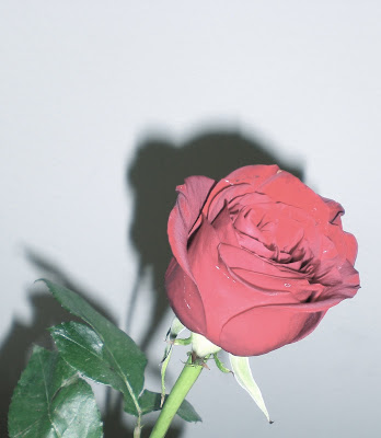
This rose was a gift I got this weekend and I just faded the color of the photo.

2.01.2009

Fieldnotes Photo 6

This is an antique-looking clock I saw while I was away this weekend.

Fieldnotes Photo 5

I took this last night, but didn't get a chance to post it. My boyfriend and I have started cooking together on the weekends, so I thought I would take a photo of something we made last night for dinner. It's grilled chicken penne with basil.