
This Week
I redesigned my cover for VOX. I took a completely different take on this design than I did for my first design. I wanted to play off of the economy side of the indie rocker story. I thought of the signs that say, "Will work for food", even thought it's a very sad idea thinking of who holds those signs, I thought I could switch it up and write "Will play for T.V." I had the idea of these artists playing for any medium just to be heard. Even if it means short pieces on television. I thought the colors resembled the indie music industry and also tied in with the photo well. This cover made me realize that I need to practice more with Illustrator, because I had some problems reworking the sign in the photo.

I was upset that our first feature designs were rejected so badly, but also was happy with my final design (above). I played with many different types of "green" (the color and photos of money). I originally wanted to have stacks of "green" and have the headline stagger on top of the stacks, but that idea fell through as I was designing, so I went with a banner-like look on the top of the first page and used the type "of the" in a jumbled way compared to the other words to illustrate our unstable economy. I also made the photos of the men bigger for these spreads because I realized how important it is that readers see who is giving them advice. I incorporated the green throughout the piece to keep it cohesive, and I'm happy with the outcome.


I also did a graffiti assignment this week, where I took photos of different typography and spelled my name. Here is the outcome...

This was difficult to do because I couldn't find letters that looked good on my camera. I'm not sure if it was the lighting or what, but the quality of them was not good. I would like to do it again sometime with a better camera. I spelled my name out of labels on food/drink products.
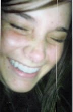
I had fun with the shutter assignment this week because I found that my photos illustrated the mood I was in each day. I think this is something I will continue to do throughout the semester and when I move to wherever I work after graduation. It also made me anxious to take my weekend digital imaging course in March.
Response
In the readings this week from Graphic Style, I was especially interested in the digital era. I was especially interested in the collage technique, because it is something I've been doing for years. I love making cards for every holiday for my friends and family members. I usually use the collage technique when I make them, as well as when I put photos on my bedroom wall. Another example of this is when I made my older brother a collage of baby pictures and remnants of his childhood for his high school graduation. Below is an example of the collage designs I'm interested in.

This, Jeremy Leslie says he miraculously has more space to blog now, without deleting any of his previous material...and write about the closure of magazines, including Domino, which is owned by Meredith Corporation. I thought this was particularly interesting that he mentioned it, since we visited Meredith last week. He also writes about reviewing Disappear Here, which had never heard of before, and judging the SPC Magazine of the Year contest in New York.

Something new and interesting I found this week is Hint magazine. It's an online, Canadian fashion magazine, and is kind of interesting to see how fashion in Canada compares to U.S. fashion.

I really like your new cover concept. It's very clever and definitely fits the story. With so many stories about the state of the economy, I'm sure you could tweak this to fit something else in the future.
ReplyDeleteI agree with Kristin. Your new cover really adds a whole new layer of information, so the reader knows more about what they're getting into.
ReplyDeleteLike the previous posts, I agree with your new concept. I think that actually going out and shooting an image like that with someone with a real message written on a cardboard sign would really help the design. It reminds me of the numerous vagabonds that sit on the side of highways. great job!
ReplyDeleteI hope I'm not being too redundant, but your cover redesign concept is dead on! I love that it's not a complete illustration and has that element of "photographic reality" that sort of captivated your attention initially. And, obviously, it's a great play on words!
ReplyDeleteWhat the heck is Disappear Here? It looks awesome! I must find out more...
ReplyDeleteThe excerpt from the collage you made your brother is totally grunge. I really like the style and texture it has, even in the online image. Take what you like and run with it, I bet you'll get great results. Personally, I'm inspired.
ReplyDeleteIf you can't push the box while you're in school... when will we be able to?
Okay, so I guess I will just first agree with everyone else and say I love the redesign of your cover! Very great concept. Secondly, I really like the collage idea too. I feel like it's something we have done since we were all really little with paper and scissors, then here in the digital age it's a fun grunge technique. Super interesting.
ReplyDeleteSeems to be the popular opinion here, but your cover redesign is good. I agree with Phil that actually shooting this photo would make for a stronger cover.
ReplyDeleteI love the Disappear Here image you posted! Definitely need to find out more.
Ditto to everyone above! I'll talk about something different - I really like your solution to the typography assignment! Great job!
ReplyDeleteI have to agree--the cover is a great idea, especially with the headline you've created. It looks very homegrown--which is what's funny about indie bands going on MTV.
ReplyDeleteAgain, great job on the cover redesign. It's my favorite by far. You looked at it an way that I think nobody else did. Not only is it creative but you executed it so well. I think the writing you did on the cardboard looks real, so great job in illustrator!
ReplyDelete